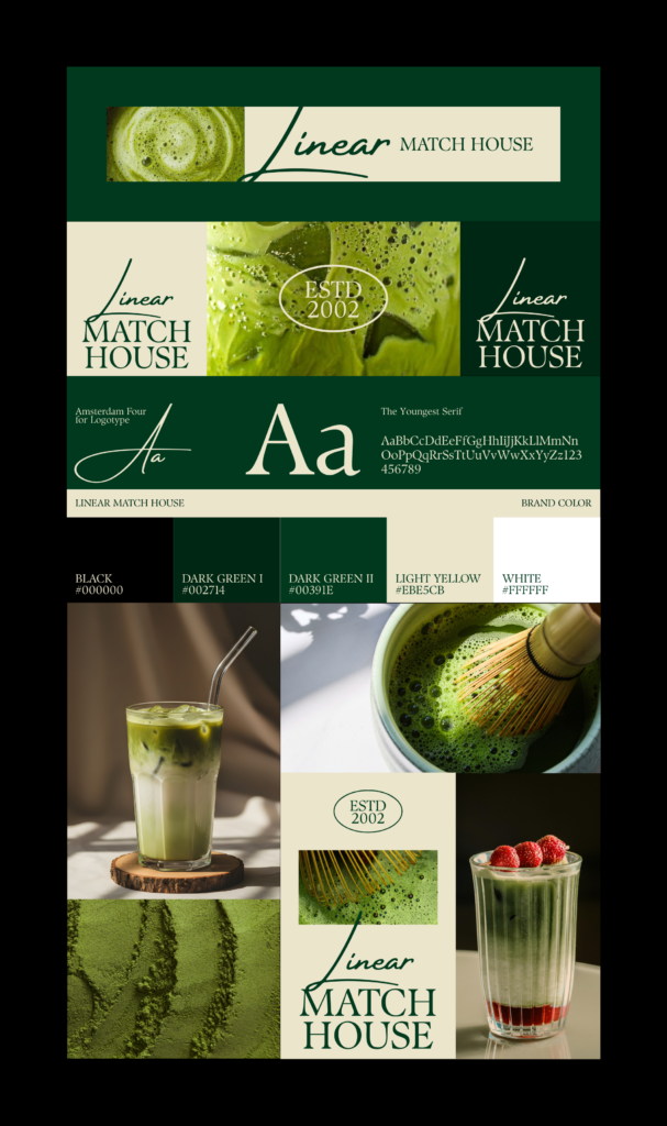
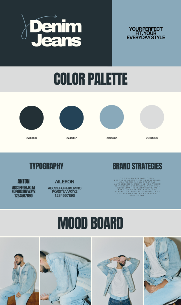
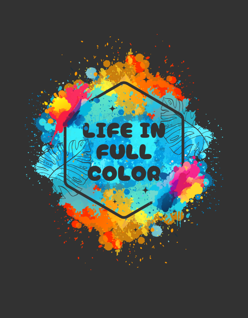
A Brand Identity begins long before a logo is recognized; it starts with color and typography quietly shaping how a brand is felt and remembered. In this project, the focus was on building a visual foundation that tells a brand’s story through intentional design choices. Colors were selected not just for their aesthetic appeal, but for the emotions they evoke and the message they communicate. Each shade plays a role in setting the mood, creating familiarity, and establishing a strong first impression that connects with the audience on an emotional level.
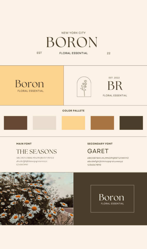
As the identity develops, typography becomes the brand’s voice. The choice of typefaces defines how the brand speaks—whether it feels modern, confident, elegant, or approachable. In this Brand Identity project, typography was carefully structured to create balance and hierarchy, ensuring clarity while expressing personality. Headings capture attention, body text maintains readability, and accent fonts add character, all working together to create a seamless visual rhythm across platforms.
What makes this Brand Identity effective is the harmony between color palettes and typography. Together, they form a system that ensures consistency across digital and print experiences, from websites and social media to marketing materials. This consistency builds trust and recognition, allowing the brand to stand out while remaining cohesive. Every design decision supports the story the brand wants to tell, making the identity feel intentional rather than decorative.
This project highlights how thoughtful design can translate abstract brand values into a tangible visual language. By combining carefully curated color palettes with purposeful typography, the Brand Identity becomes more than a style guide—it becomes a storytelling tool. It reflects my ability to create visual systems that are not only visually appealing but also meaningful, adaptable, and aligned with the brand’s long-term vision.
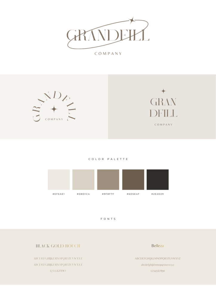
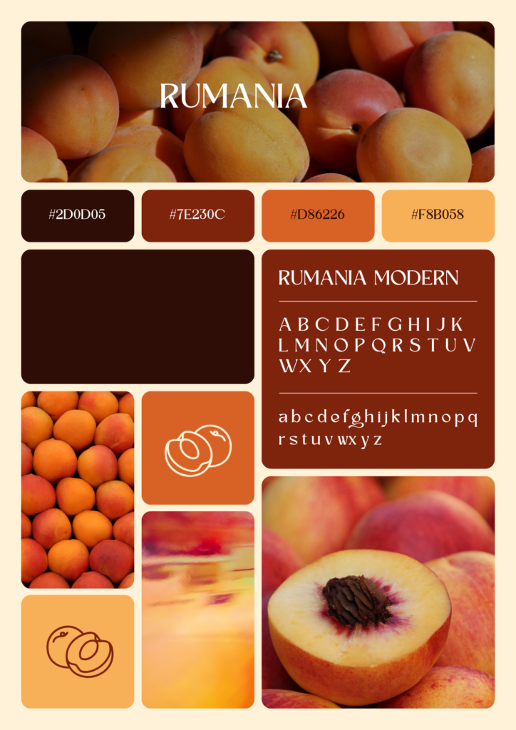
A Brand Identity is the visual heartbeat of any brand—it tells a story before a single word is read. For this project, I focused on defining a brand’s personality and voice through the careful selection of color palettes and typography using design principles that ensure consistency and emotional connection. Colors are more than decoration; each hue carries meaning, evokes feelings, and helps the audience instantly recognize the brand. The chosen palette reflects the brand’s values, whether it is bold and energetic, calm and trustworthy, or modern and innovative, and provides a visual language that speaks across digital and print platforms alike.
Typography complements color by giving the brand a distinct voice. In this project, I selected typefaces that align with the brand’s tone—headings that capture attention, body text that reads effortlessly, and accent fonts that add flair without distraction. The careful hierarchy and structure of typography guide the audience’s eye, making every message clear and cohesive. Through the combination of fonts, spacing, and style, the brand communicates its personality consistently, establishing familiarity and trust over time.
The true strength of this Brand Identity lies in the harmony between color and typography. Together, they create a system that ensures every design element—whether a website, social media post, or printed material—feels unified and intentional. This system supports the brand story, making it easier for the audience to engage with and remember. Every decision, from the shade of a primary color to the curvature of a typeface, was made with the purpose of conveying meaning and emotion while maintaining visual consistency.
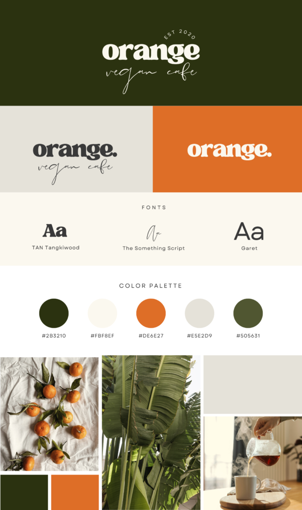
This project demonstrates how thoughtful design can turn abstract brand values into tangible, memorable experiences. By combining curated color palettes with purposeful typography, the Brand Identity becomes more than a visual guideline—it becomes a storytelling tool that communicates the essence of the brand. It reflects my ability to craft visual systems that are not only aesthetically appealing but also functional, cohesive, and capable of leaving a lasting impression across multiple touchpoints.
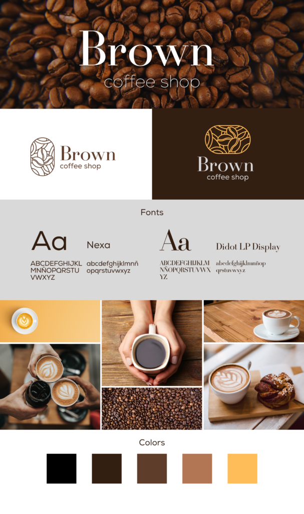
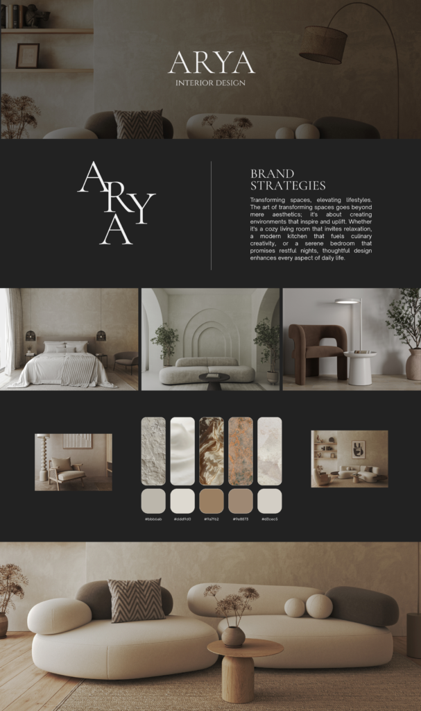
A Brand Identity is more than a logo or a visual; it is the story a brand tells without words. In this project, I focused on creating a cohesive identity by carefully selecting color palettes and typography that reflect the brand’s personality and values. Colors are the first emotional touchpoint—they set the tone, evoke feelings, and leave lasting impressions. Each hue was chosen deliberately, whether to communicate trust, energy, creativity, or elegance, forming a visual language that guides every interaction a viewer has with the brand. By establishing a consistent color system, the brand gains instant recognition and emotional resonance across digital and print platforms.
Typography works hand in hand with color, giving the brand a distinct voice and rhythm. In this project, I chose typefaces that complement the brand’s tone—headings to grab attention, body text for readability, and accent fonts for personality. Typography establishes hierarchy and structure, directing the viewer’s eye and ensuring the content is easy to scan and understand. Through careful alignment, spacing, and style, the typefaces communicate the brand’s character, making every message feel intentional and cohesive.
The power of a Brand Identity lies in the harmony between color and typography. Together, they create a system that maintains consistency across all touchpoints, whether it’s a website, social media post, advertisement, or packaging. This visual cohesion strengthens the brand’s story, building trust and recognition with the audience. Every design choice—from primary colors to font pairings—is a deliberate step in narrating the brand’s essence and ensuring that it feels unified and professional.
This project demonstrates how design can transform abstract brand values into a tangible, memorable experience. By thoughtfully combining color palettes with typography, the Brand Identity becomes more than a visual guide—it becomes a storytelling tool. It reflects my ability to craft visual systems that are not only aesthetically compelling but also functional, cohesive, and capable of leaving a lasting impression across every platform the brand touches.


Leave a Comment