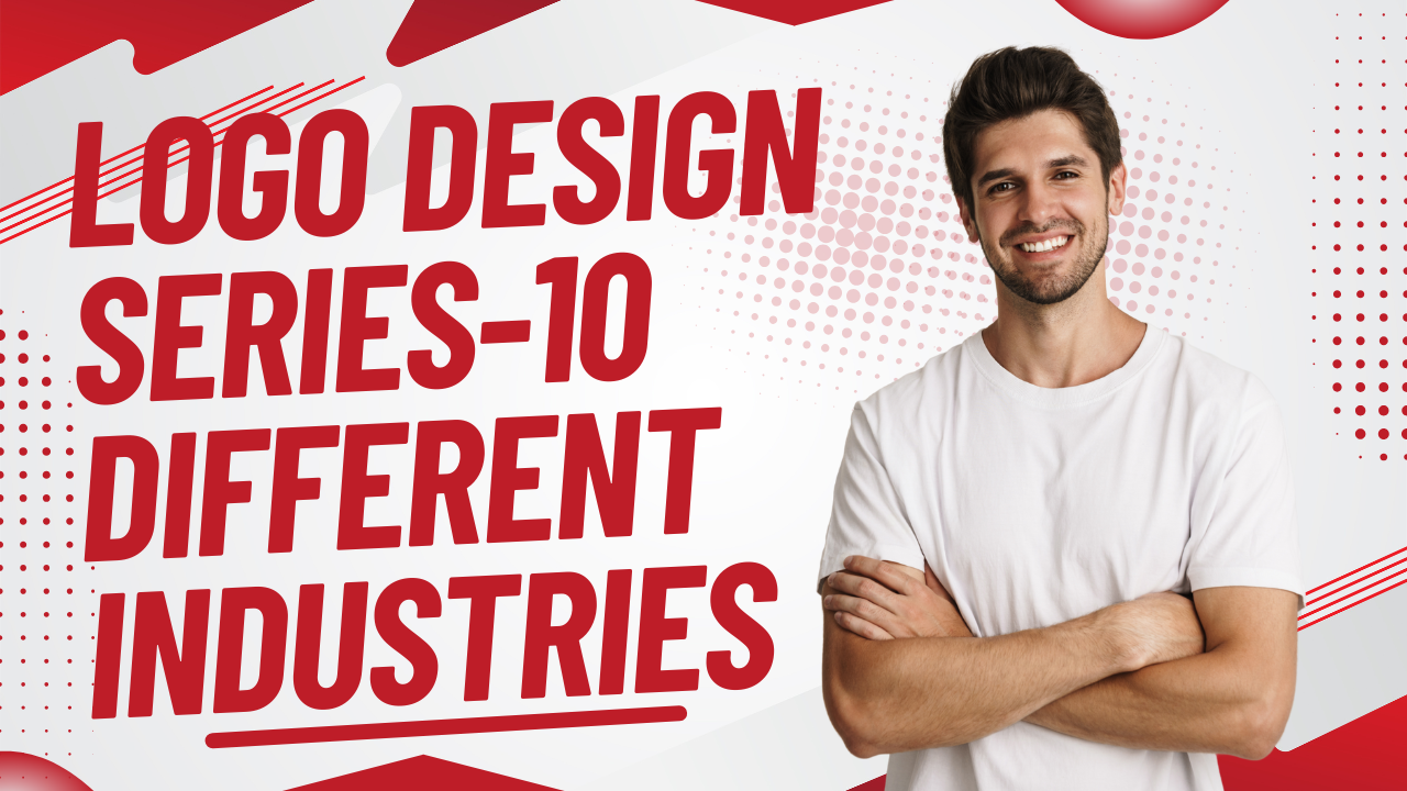
Today’s project in my portfolio, “Logo Design Series – 10 Different Industries,” is more than a visual exercise—it’s a journey through stories, identities, and purpose. Every logo begins with a question: Who are you, and how do you want to be remembered? This series explores that question across ten unique industries, each with its own voice, values, and audience. From the bold confidence of a tech brand to the warm trust of a healthcare identity, from the playful energy of a creative studio to the grounded reliability of a construction or real estate brand, each logo tells a story before a single word is spoken.
In this project, I approached every industry as if it were a character in a larger narrative. I studied how they speak to their customers, what emotions they evoke, and what visual language best represents them. Colors were chosen not just for beauty, but for meaning. Shapes were crafted to communicate stability, innovation, elegance, or movement. Typography became a personality—sometimes strong and commanding, sometimes soft and welcoming. Each logo is designed to stand alone, yet together they form a cohesive series that reflects adaptability and thoughtful design thinking.
The goal of this series is to demonstrate how logo design is not about decoration, but about strategy and storytelling. A logo must work in silence, on screens and paper, in large formats and small icons. It must represent an entire industry in a single mark while still feeling unique and memorable. By designing for ten different industries, I challenged myself to step outside one style and embrace versatility, problem-solving, and creative discipline.
This project represents my belief that great logos are built at the intersection of research, creativity, and emotion. The Logo Design Series – 10 Different Industries is a reflection of how design can adapt, evolve, and connect—turning simple symbols into meaningful brand stories.
This project began with a simple idea: every industry has a story, and every logo is the opening line of that story. In this series, I stepped into ten different worlds—each with its own purpose, audience, and emotional tone—and translated those identities into visual marks that speak without words. Rather than designing logos as isolated graphics, I treated each one as a character shaped by its environment, values, and ambitions.
As the project unfolded, I shifted perspectives constantly. One day, I was designing for innovation and speed, capturing the sharp clarity of a tech-driven brand. Another day, I slowed down to reflect trust, care, and human connection for service-based or wellness-focused industries. Some logos demanded boldness and authority, while others needed warmth, simplicity, or creativity. Color choices became emotional cues, shapes turned into symbols of growth, stability, or movement, and typography evolved into a voice that could whisper or confidently speak out.
This series challenged me to balance consistency with adaptability. While each logo stands independently, together they form a unified collection that highlights my ability to think strategically across diverse industries. The process pushed me to research deeply, understand brand psychology, and design with intention rather than aesthetics alone. Every concept was built to be functional, scalable, and memorable—capable of living across digital platforms, print, and real-world applications.
Logos are not just symbols, they are storytellers. They capture the essence of a brand in a single glance and create the first emotional connection with an audience. This project represents growth, versatility, and the belief that strong design begins with understanding, empathy, and a clear story waiting to be told.
This project began with curiosity—how can a single visual mark capture the personality of an entire industry? Each logo in this series represents a different sector, approached as a unique story with its own tone, challenges, and audience. Instead of repeating one visual style, I allowed each industry to guide the design process, shaping how colors, forms, and typography came together.
As I moved from one industry to another, the mindset behind each design shifted. Some industries required bold, confident symbols that communicate strength and reliability, while others needed softer, more human-centered identities that evoke trust and warmth. There were moments where simplicity became the strongest statement, and others where detail and structure played a key role. Every design decision was intentional, rooted in understanding what the brand stands for and how it wants to be perceived at first glance.
This series is not just about aesthetics—it’s about problem-solving and storytelling. A logo must speak clearly in seconds, whether it appears on a website, a mobile screen, packaging, or signage. Throughout this project, I focused on creating logos that are versatile, scalable, and timeless, ensuring they remain effective across multiple platforms and contexts. Each logo is designed to function independently, yet together they form a cohesive collection that highlights flexibility and strategic thinking.

Leave a Comment